|

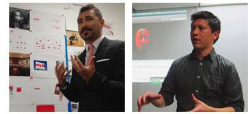
TOM SIEU AND JOHN BARRETTO OF COLOR IN ACTION
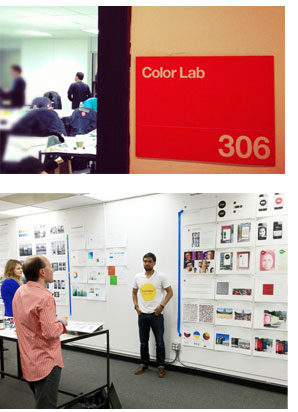
 Without question, good design enhances our lives esthetically and functionally. But how about socially? Can design be a power for social change? COLOR IN ACTION, a project of faculty and students at Academy of Art University in San Francisco, set out to explore that possibility, as student teams devised projects that examined relationships between color and social behavior. TONES reached project leaders Tom Sieu and John Barretto soon after the winning student team received a $10,000 scholarship from project sponsor Pantone.
TONES: How did you come up with the idea for this project?
 TOM SIEU: The Pantone and AAU collaboration was built upon the idea of using design to create positive social change. We (Academy of Art Graphic Design students) have been testing this model for the past three years within the classroom walls of AAU, functioning as a think tank to broaden the definition of design. Recently, our students have been taking on social design challenges with actual organizations like The Living Principles and GOOD Magazine. And now we have had an opportunity to collaborate with Pantone to achieve the same goals using color as a key driver.
JOHN BARRETTO: I was lucky enough to have Tom include me on this project. The 601 Type Systems class in the graduate program at the Academy of Art has historically produced books as their final deliverable. My project has focused on producing a concept book promoting a museum that should exist in this world based on public need and the individual student's personal interests and passions. When Tom approached me about this opportunity, I modified the Museum project so that color could play a more important role in applications and also required that the Museum be a destination that betters the world we live in. In the past, only a minority of students have produced work that addresses social issues so this was a nice way to get the students to consider projects that are personal and meaningful to society.
TONES: What guidelines did you give your students for selecting their themes?
TOM SIEU: Students were asked to brainstorm ideas that were close to their heart and reflected who they are as a person, but they were challenged to consider the greater good of the project. So long as the subject matter addressed a social cause, the guidelines were pretty loose.
 TONES: How were the student teams organized?
JOHN BARRETTO: After a couple rounds of brainstorms and generating moodboards to visually support their ideas, general themes started to emerge in the classroom so students were grouped together based on these consistencies.
TONES: How were the projects evaluated?
JOHN BARRETTO: Projects were evaluated based on how well they incorporated color as a device to bring recognition to their cause. Because this was a group project, teams were evaluated on their collaboration and their process and ability to push the project as far as they could. There are a number of audience touchpoints that needed to be addressed and the success of the project was determined by how well the system holds up across multiple deliverables.
TOM SIEU: We evaluated how each project could possibly become a reality and be implemented. So it goes from purely conceptual to something tangible and actionable.
TONES: Were the students required to form a hypothesis, to be proven or disproven? Or were the projects more of an exploration?
TOM SIEU: The students were asked to frame their problem in a way that forced them to question everything along the way. This resulted in much more exploration than students are used to. Rather than getting down to the tactical, students spent most of the first half of class researching their subject matter, formulating their ideas and developing a strategy for execution.
TONES: As art instructors, going in you must have had certain expectations about the behavioral influences of particular colors. Did your expectations pan out, or were there some surprises?
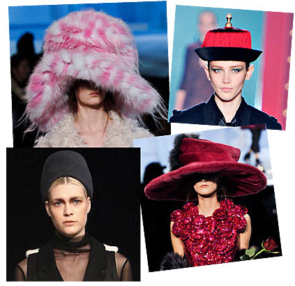
TOM SIEU: As we were preparing the brief for the class, we anticipated certain colors to have associated meanings based on culture, history and trend. For example, warm colors = active, cool colors = calm or more specifically red = aids, green = eco. We pushed each team to either accept the color perception and take it to the next level OR challenge it and define why.
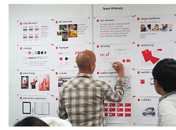
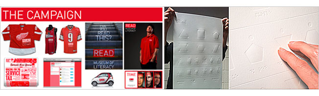
Team Literacy used the boldness of red as a strong call-to-action to promote reading. They equate red = read as a clever hook to brand their campaign and took into account that it's difficult to ignore red.
Team Sense, on the other hand, looked at how color is interpreted through someone who is visually impaired. This process turned out to be a completely different evaluation of color influence. The result was a system of symbols in braille to help define color choices and preferences on a daily basis. This was an unexpected surprise.
 JOHN BARRETTO: After studying art and having a working knowledge of color theory, I learned some basic color principles; but it has taken the full course of my career to understand how color can express or evoke certain emotions. It was nice to see students considering how color communicates this early on in their careers in a highly conceptual way. If anything, I was surprised by how well they embraced the concept.
TONES: Do you feel there is a direct cause-and-effect between the design we encounter in our environment and our social behavior? Or is it more subtle?
TOM SIEU: There is definitely a direct cause-and-effect between design and our environment. The impact can be overt or subtle depending on its purpose and intent. I'm a big believer that "designers" bring to the table a value that goes beyond just skinning the surface. It's the ability to design for a complete experience vs. just designing a thing. This means being able to see the bigger picture and understand more ways to reach our audience effectively along the way. And as we've seen with this collaboration, color can play a huge role to shape the storytelling from beginning to end. We are the narrators.
JOHN BARRETTO: Sure. I believe that good design has the ability to affect your social behavior. It's the subtlety that often times makes it good though. Today, the lines between architecture, interior design and graphic design are blurring. We are all "designers" and color can work the same way whether in 2D or 3D. If anything, graphic design adds a layer of messaging to the use of color and form that makes it even more powerful in influencing human behavior.
TONES: Will this be a recurring project at the Academy? Based on the results of this project, what will you do next or as a follow up?
TOM SIEU: This project will continue after this semester. The interest and need is there. The form and shape of its storytelling may evolve, depending on the circumstance, but the goal will remain the same – that is, to design for the greater good and with a social cause in mind. We will also continue to help shape past and present student projects, to become a reality. This is an on-going initiative that goes beyond the classroom.
JOHN BARRETTO: I'd love to see this continue. If not, it has definitely influenced my approach to the Museum project in future iterations. It will be interesting to see how the students respond to the feedback. I believe several of them have projects that can become realities if they chose to push their ideas forward. I always feel connected to each and every one of my students after the completion of a class and I would support them in any way if they chose to bring their ideas to fruition.
 EDITOR'S NOTE:
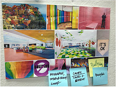
The judges selected Team Bullying as the winner of the Color in Action project. Team Bullying posed the question, "How Does Color Affect a Developing Brain and Can We Use it to Lower Aggression and Teach Tolerance?" Studies have shown that one's physical environment directly impacts behavior, and certain colors are linked to increases in brain development, visual processing and lowered stress. With today's alarming rates of bullying-related violence and suicides, Team Bullying set out to see if color could be a force for positive change. The team's goal was to use color as a tool for enhancing the school environment, building community and embracing diversity.
Read more about Color In Action on the project blog or Facebook page, see the winning project, or visit the AAU website.

|


|
|
|
|
|
This is an outbound E-mail only. We will be unable to respond to your reply.
® Pantone LLC, 2012. All rights reserved.
Pantone LLC, 590 Commerce Boulevard, Carlstadt, NJ 07072
PANTONE® and other Pantone trademarks are the property of Pantone LLC.
Pantone LLC is a wholly owned subsidiary of X-Rite, Incorporated.
|
|
|
|


 welcome with its wallpaper design of red Bird-of-Paradise flowers against an architectural mountainscape. Now you can truly dream in color.
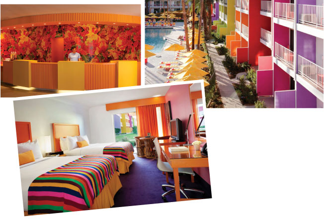


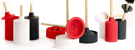
 Making a bold and colorfully modern statement, the WC Line designed by Josh Owen for